Customer Journey Map
A visual tool for tracing the complete customer experience - what they do, feel, and encounter at every stage, and what your organisation does behind the scenes to create it.
Get the free template
A customer journey map is a visual tool that traces someone's complete experience with your organisation - from the moment they first become aware of you through to their decision about what happens next. It's one of the most practical ways to understand not just what your customers go through, but what's happening inside your organisation that creates that experience.
What is customer journey mapping?
Customer journey mapping is the practice of plotting the end-to-end experience of a customer, service user, or beneficiary across every stage of their interaction with you. It makes the invisible visible: the emotions people don't voice, the handoffs they don't see, the internal processes that shape what they receive.
The practice has roots in service design, drawing on ideas from Jan Carlzon's work on "moments of truth" in the 1980s and Lynn Shostack's service blueprinting. It's now used widely across commercial, public sector, and nonprofit organisations - anywhere the experience someone has depends on how well different parts of an organisation work together.
What makes journey mapping different from a process map or a workflow diagram is perspective. A process map starts from the organisation's point of view: here's what we do, step by step. A journey map starts from the customer's: here's what it's like to be on the receiving end. That shift in perspective is what makes it powerful. It reveals gaps between what the organisation thinks it delivers and what people experience.
A journey map typically reads left to right across a series of stages - from first awareness through to reflection on the experience. But the real value isn't in the stages themselves. It's in the layers beneath them.
How a customer journey map works
Every journey map has two dimensions. Stages flow left to right, representing the journey through time. Layers stack top to bottom, representing depth - from what's visible on the surface to what's hidden inside the organisation. The diagram above shows five example stages and four layers. The stages are always context-specific (you rename them for your own situation), but the four layers are the model's core structure.
Customer actions
The top layer captures what the customer does at each stage - the visible, observable behaviour. In the Awareness stage, they might search online or ask a colleague for a recommendation. In Access, they fill in a form or make a phone call. In Reflection, they weigh up whether the experience met their expectations.
This layer is the most straightforward to map, because it deals in facts. But it's also the shallowest. Knowing that someone filled in a contact form tells you nothing about whether they found it easy, whether they nearly gave up, or whether they'd recommend the experience to someone else. For that, you need the next layer down.

Emotional landscape
The second layer captures what the customer thinks and feels at each stage. This is the thread that turns a table into a journey - it flows continuously across the map as a curve, with peaks (moments of confidence, relief, delight) and valleys (confusion, frustration, anxiety).
The emotional landscape is where most of the insight lives. When you plot this curve with real data - from interviews, feedback, observation - patterns emerge. You might discover that customers feel optimistic at the start but hit a sharp dip during onboarding, or that the experience itself is fine but the follow-up feels like falling off a cliff. These dips and peaks point directly to where intervention will make the biggest difference.
The emotional curve also reveals something organisations often miss: the gap between what they think customers feel and what customers actually feel. A team might assume the booking process is smooth because it works technically. The emotional layer might show that customers feel anxious and uncertain at exactly that point - not because the system is broken, but because nobody tells them what happens next.

Touchpoints and channels
The third layer maps where the customer and the organisation meet - the points of contact. A touchpoint might be your website, a phone call, an email, a face-to-face session, a physical letter, or a waiting room. The channel is how that touchpoint is delivered.
This layer sits at what the diagram calls "the line of visibility" - the boundary between what the customer can see and what they can't. Everything above this line is part of the customer's conscious experience. Everything below it is the machinery that makes it work.
Mapping touchpoints reveals fragmentation. Most organisations deliver their service through a patchwork of channels that were built at different times, by different teams, for different purposes. The customer experiences this as inconsistency: they explain their situation on the phone, then have to repeat it in an email, then again at their first appointment. Empathy mapping at each touchpoint can help you understand what's working and what creates friction.

Organisational reality
The bottom layer is where the journey map becomes a diagnostic tool. It captures what the organisation does behind the scenes to create each touchpoint - the processes, systems, handoffs, policies, and team structures that the customer never sees.
This is the layer that connects customer experience to organisational design. A frustrating handoff between departments shows up here. A slow response time traces back to a process bottleneck. An inconsistent experience reveals that two teams are following different procedures for the same thing. The service blueprint takes this layer further, mapping the full back-stage operation in detail.
For practitioners working in customer experience and evolving service design, this is where the map earns its keep. It bridges the conversation between the people who design services and the people who run operations. It makes the connection between "our customers are frustrated" and "here's what's causing it" - not as opinion, but as a traceable chain from experience to system.

Customer journey map vs service blueprint
Journey maps and service blueprints are closely related - both start from the customer's experience and share the same foundation of customer actions across stages. The difference is what each tool maps beyond that shared starting point.
A customer journey map stays with the customer. It adds what they think, how they feel, and where they encounter the organisation along the way. The emotional layer is what makes it a journey map rather than a process diagram - it captures the human experience of being on the receiving end.
A service blueprint takes those same customer actions and maps the full organisational machinery beneath them - the front-stage actions customers can see, the back-stage processes they can't, and the support systems that hold the whole thing together. Both tools share the "line of visibility" as a structural dividing line, but a blueprint maps what happens below that line in far more detail than a journey map does.
In practice, the two work as a sequence. The Nielsen Norman Group describes service blueprints as a "sequel" to customer journey maps - you map the journey first to understand where the experience breaks down and which moments matter most, then blueprint the specific touchpoints that need redesigning to understand what's causing the problem operationally. The journey map tells you where to look; the blueprint tells you what to change.
How to build a customer journey map
Building a journey map is a research exercise, not a brainstorm. The most common mistake is filling it in from assumptions rather than evidence.
Define who you're mapping. A journey map follows one type of customer through one scenario. If you try to map everyone's experience at once, you'll end up with something too generic to act on. Use audience personas to identify whose journey matters most for the question you're trying to answer.
Choose the scope. Decide where the journey starts and ends. A full end-to-end map (from first awareness to ongoing relationship) gives you the big picture. A focused map (just the onboarding stage, or just the complaint process) gives you more depth on a specific problem. Start with whichever matches the decision you need to make.
Gather real data. Interview customers. Review feedback and complaints. Shadow the front-line team. Pull analytics. The Nielsen Norman Group's research on journey mapping reinforces a point worth repeating: a journey map is only as good as the evidence behind it. The emotional layer in particular requires you to listen to people describe their experience in their own words - surveys with satisfaction scores won't give you enough texture.
Map the stages first, then fill in the layers. Start by identifying the main stages of the journey. Then, stage by stage, fill in what the customer does, what they feel, where they interact with you, and what your organisation does behind the scenes. Work in a cross-functional group - no single team sees the whole picture.
Mark the moments that matter. Once the map is populated, look for the peaks and valleys in the emotional curve. These are your priority areas: the bright spots to protect and the pain points to fix. One well-chosen improvement to a single pain point often does more than a broad programme of incremental changes.
Example
A local council wants to improve the experience of residents applying for social housing. The team maps the journey from "recognises they need housing support" through to "settled in a new home."
The emotional curve reveals a sharp dip at the application stage - residents describe feeling overwhelmed by the form, uncertain about eligibility criteria, and anxious about how long the process will take. The touchpoint layer shows the application is online-only, with no way to ask questions during the process. The organisational reality layer shows that the housing team receives completed forms but has no mechanism to follow up with applicants who start but don't finish.
The map makes the intervention obvious: add a way for applicants to ask questions during the form (a chat function or a phone number), send a follow-up to anyone who starts but doesn't complete, and set clear expectations about timescales at the start. These are small, specific changes - but they address the exact point where the experience breaks down.
Limitations
Customer journey maps are a snapshot of experience at a point in time. Customer expectations shift, services change, and what was a smooth experience last year might be a pain point today. A map that sits in a drawer loses its value quickly - it needs revisiting as conditions change.
The quality of a journey map depends entirely on the quality of the research behind it. A map built from assumptions rather than evidence will confirm what the team already believes rather than revealing what they're missing. The emotional layer is particularly vulnerable to projection - it's easy to assume you know how customers feel.
Journey maps show the experience from the customer's perspective, but they don't show why the organisation works the way it does. A frustrating process might exist because of a regulatory requirement, a budget constraint, or a decision made years ago that nobody's revisited. Process mapping and service blueprints fill this gap by mapping the organisational side in more detail.
Finally, a journey map is a diagnostic tool, not an action plan. It shows you where the problems are, but the work of fixing them requires a different set of conversations - about priorities, resources, ownership, and willingness to change.
Getting started
Pick one journey that matters to your organisation right now - the one your leadership team keeps asking about, or the one generating the most complaints. Don't try to map everything. Interview five customers who've been through that journey recently, and ask them to walk you through it in their own words. Plot their experience across the four layers: what they did, what they felt, where they interacted with you, and what was happening on your side. The pain points will become visible quickly - and from there, you'll know where to focus.
We share thinking on organisational change and development on LinkedIn - practical ideas for people doing this work inside their own organisations.
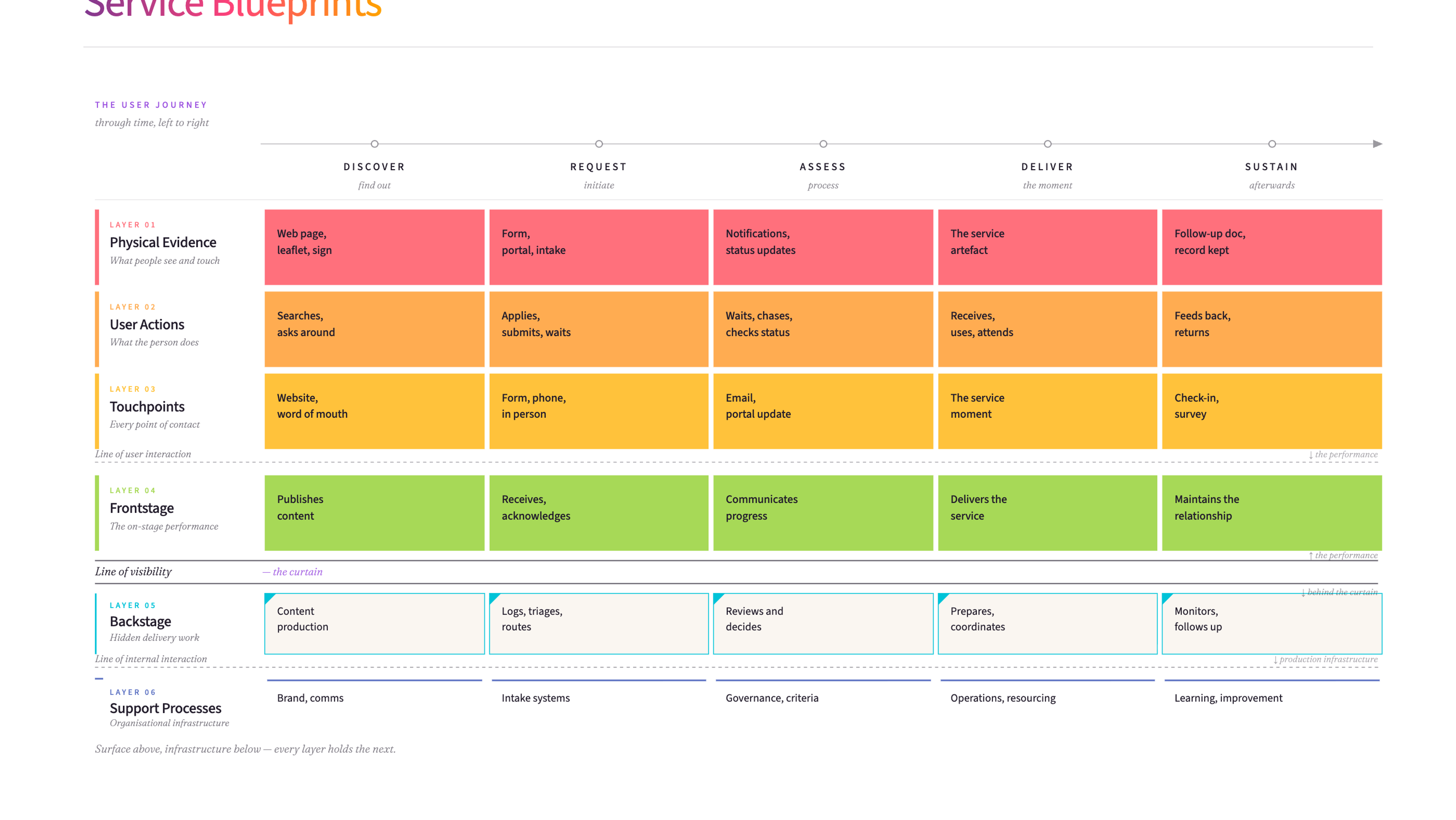
A service blueprint is a detailed map of how a service actually works - what the user sees and experiences on the front end, and everything happening behind the scenes to make it possible. It helps organisations redesign services by showing the full picture.
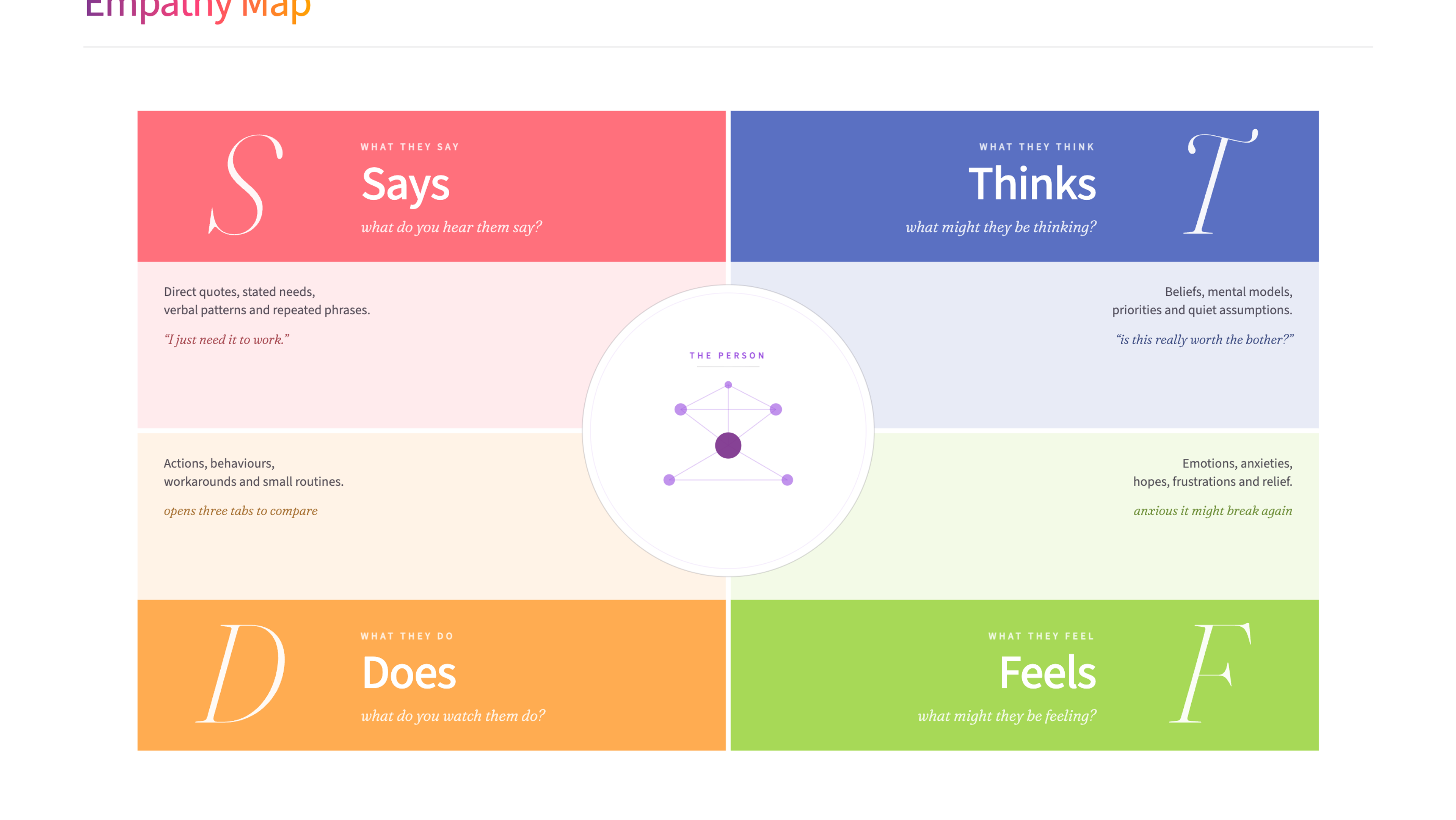
An empathy map is a collaborative visualisation tool that captures what we know about a user's behaviours, thoughts, feelings, and motivations, helping teams develop deeper understanding and more human-centred solutions.
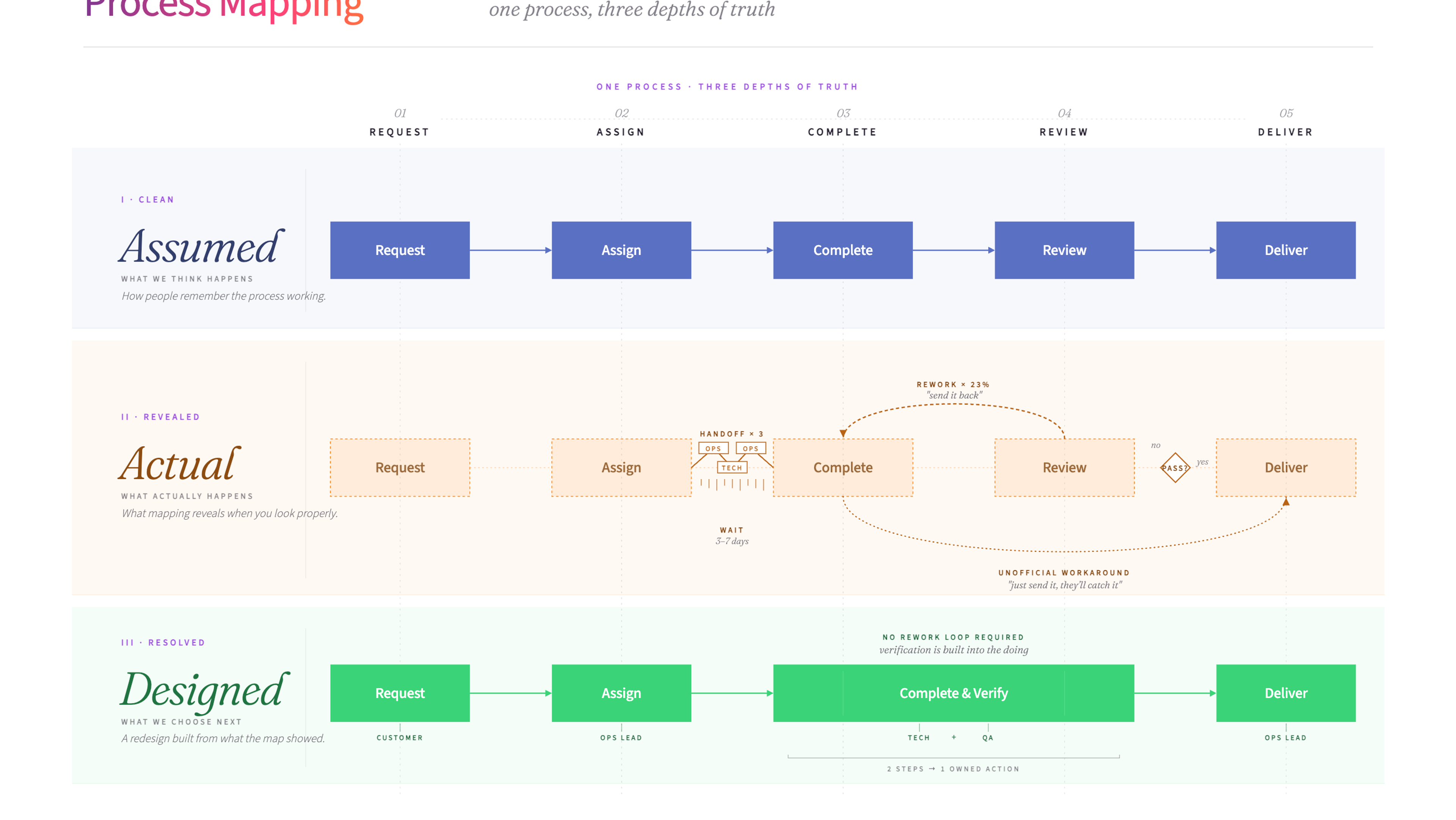
Process mapping is a visual method for documenting how a process works from start to finish. It helps teams see the full picture - every step, decision point, and handoff - so they can spot problems and design improvements.
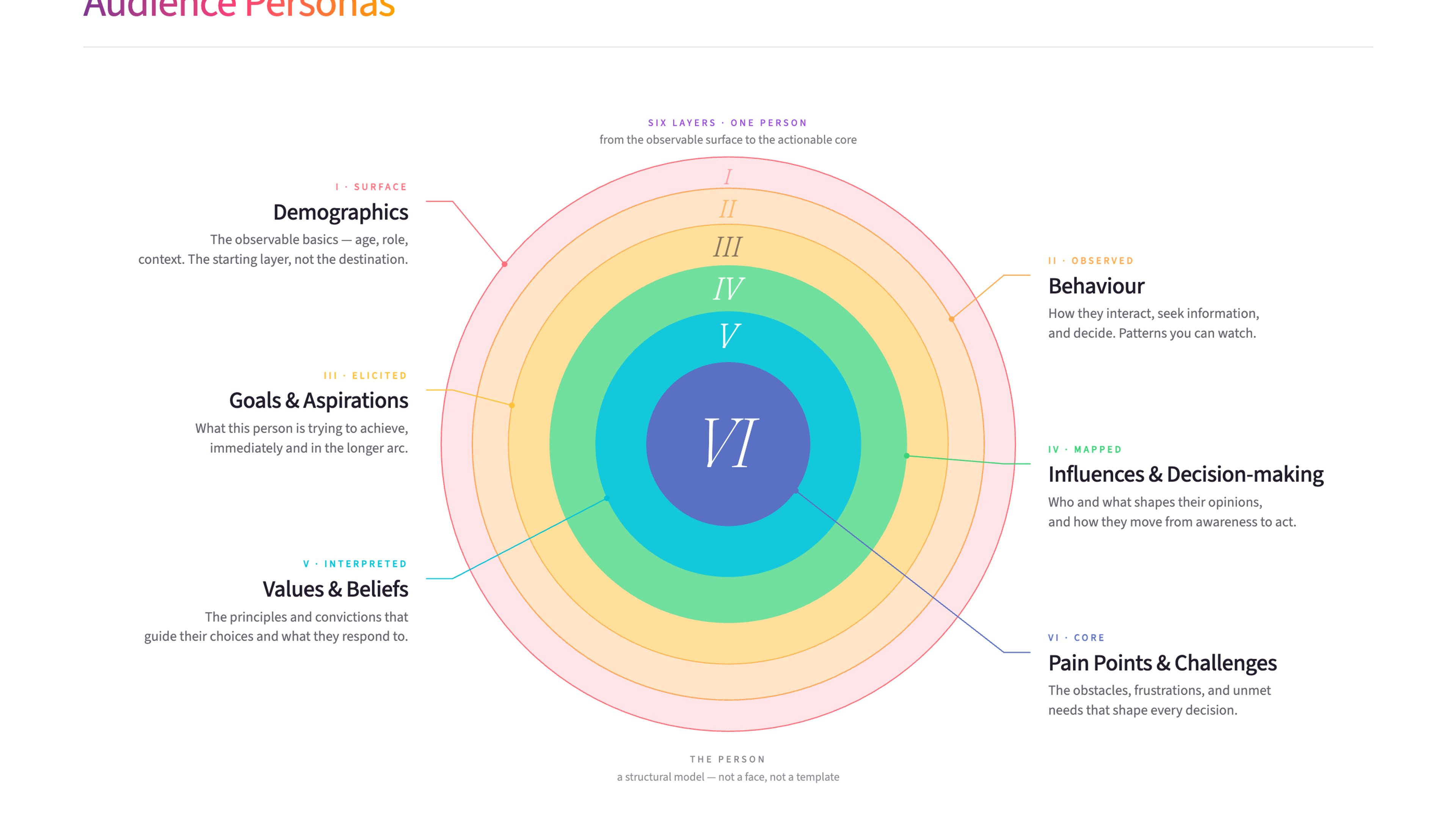
Audience personas are detailed profiles of the people you're trying to reach, built from real research into their needs, behaviours, and motivations. They help organisations design services and communications that actually resonate with the people who matter most.
Ready to use Customer Journey Map?
Download the free template - includes practical guidance for workshops and team sessions.
Get the free template
Want to put these ideas into practice?
Whether you're navigating a merger, rethinking how you're structured, or trying to shift a culture that isn't working - underneath, it's the same job: getting the whole organisation pulling in the same direction. Start with a conversation.