Change Management Training
You’ve got change to deliver - and people who’ll be leading it. We help you build their capability to lead it well, with training designed around your organisation.

Why change management training matters
However change arrives in your organisation - a restructure, a new system, a shift in strategy - someone has to lead people through it. Plans and programmes set the direction. People make it real.
What we keep seeing, across very different organisations, is that the difference between change that lands and change that fades comes down to the people leading it day to day. The managers translating the plan into Monday morning. The sponsors keeping it alive in rooms the programme team never sees. This training exists to back them.
How our change management training works
Every course here runs the same way - in-house, shaped to you, built for the people doing the work.
In-house, for your group. In person at your place or online. We don’t run open courses with seats to fill; we bring the training to you.
Shaped before we arrive. Every course starts with a conversation: what’s the change, who’s in the room, what’s already been tried? The day your people get draws on your structures, your language, your actual change - not a case study about a company none of you have met.
Built for the people making change happen. Managers leading teams through it, sponsors keeping it moving, programme teams holding the whole thing together. Some organisations mix the groups in one room; others run the same course separately for each. Both work.
The courses
Change management training - the fundamentals
A two-day grounding in the core frameworks and practical tools that make change work - built around a real change from your organisation, not a textbook case. It’s for anyone responsible for making change happen: project managers, HR professionals supporting a restructure, team leaders bringing in new ways of working. No prior change management experience needed - if you have some, this gives it structure; if you don’t, it gives you a foundation.
What you’ll work on
Over two days, you’ll build a complete change approach for a real initiative - yours or one from your organisation. The course is structured around four things every change practitioner needs to get right.
Understanding where people are. Before you can move people from here to there, you need to know where ‘here’ is. You’ll use the ADKAR model to assess where individuals and groups are in their readiness for change, and the change curve to read the emotional journey people go through during transitions. These aren’t abstract models - you’ll apply them to your own situation and see straight away where the gaps are. For a deeper look at readiness, see our guide to assessing change readiness.
Planning your approach. Change doesn’t happen because someone writes a plan. It happens when people understand why the change matters, what it means for them, and what they need to do differently. You’ll use Kotter’s 8-step process and stakeholder mapping to design an approach that accounts for the human side of change - not just the project plan.
Getting communication right. Change communication works best when it talks with people, not at them. You’ll develop a communication approach for your specific change - who needs to hear what, when, through which channels, and how you’ll listen as well as broadcast.
Keeping it on track. A plan is only as good as your ability to adjust it. You’ll learn practical ways to monitor how change is landing, spot problems early, and adapt when things don’t go as expected.
How the days work
Day one covers the core frameworks - change psychology, assessing readiness, designing your approach. Day two turns to communication, implementation, and building the complete plan. Throughout, you alternate between short inputs from the facilitator, structured exercises, and working sessions applying everything to your own change. Groups stay at twelve to twenty people, so everyone gets time on their specific challenges.
What you’ll take away
A completed change plan for your real initiative, built with proven frameworks as the course goes along. A stakeholder map showing who matters most and how to engage them. A communication approach tailored to your situation. And the confidence that comes from having practised these tools, not just read about them.
What makes this different
We’re preparing you for Monday morning, not an exam - the real conversations, decisions and situations waiting when you’re back at your desk. We draw on the best frameworks from across the field rather than tying ourselves to a single methodology, and every hour is focused on application. You leave with something you can use, not just something you’ve learned about. If your organisation needs broader support with the change itself, our change management consultancy works alongside leadership teams to design and deliver it.
Leading your team through change
Something has changed - or is about to - and your team is looking at you for answers. This practical one-day course is for managers and team leaders guiding their people through a change they didn’t design: a restructure, a new system, a new way of working. Research consistently points to managers as the biggest factor in whether change succeeds - and the group that gets the least support. This day is that support.
What you’ll work on
This isn’t a lecture about change models. You’ll spend the day working on your real situation, using proven frameworks adapted to your context. The day is built around three practical challenges managers face during change.
Understanding what your team is really experiencing. Change affects people differently - some adapt quickly, others need more time, more information, or more support. You’ll map where each team member is in their own transition using the change curve, Bridges’ transition model and the Satir Change Model - not as theory, but as practical lenses for reading your team and working out what each person needs from you right now.
Having the conversations that matter. The hardest part of leading change is often the conversations. The team member who’s quietly disengaging. The person who keeps raising objections in meetings. The high performer who’s thinking about leaving. You’ll practise these conversations using realistic scenarios, and leave with approaches you feel confident using.
Building a team change plan. By the end of the day, you’ll have a written plan for leading your team through this specific change - not a generic template, but a plan built from your actual situation, covering what you’ll communicate, when, and how you’ll support different people through the transition.
When change comes on top of change, change fatigue becomes a real risk across a whole team - spotting it early is one of the most useful things a manager can do.
How the day works
The format is interactive and collaborative. You’ll work in small groups throughout the day, sharing experiences and learning from other managers facing similar challenges. Sessions alternate between short input from the facilitator, structured exercises, and time to apply what you’ve learned to your own situation. Groups stay small - typically twelve to sixteen people - so everyone gets individual attention.
What you’ll take away
A completed team change plan covering where each team member is in their own transition and what they need, a communication approach tailored to your team’s specific concerns, planned conversations for the people who need individual support, and a realistic timeline for the next four to six weeks. And confidence in your own ability to lead your team through what comes next.
What makes this different
This course is about using change models, not just learning them. The focus is entirely practical - you work on your real change, with your real team in mind, and leave with something you can act on immediately. We draw on a range of recognised frameworks - ADKAR, Kotter’s 8-step model and others - rather than relying on a single methodology, adapted to fit your context. If your organisation is going through broader change and needs support beyond training, our change management consultancy can help design and guide the wider programme.
Building the case for change
You can see the change that needs to happen - the problem isn’t the idea, it’s getting other people to see what you see and commit to it. A one-day course for leaders at any level building support for significant change: board approval, cross-functional buy-in, a leadership team ready to move. Equally useful for change managers and programme leads helping sponsors articulate the case for their initiatives.
What you’ll work on
You’ll work on a real change initiative throughout the day - something you’re currently building support for, or something you know is coming. Data alone rarely persuades anyone; people decide based on a mix of logic, emotion, trust, and what they see others doing. The day covers three connected areas.
Reading the room before you make the case. Before you can persuade anyone, you need to understand what matters to them. You’ll map the stakeholders involved in your change using tools like the Mendelow power-interest matrix, understand their priorities and concerns, and design an engagement approach that builds support in the right sequence - because talking to the wrong people first can create resistance before you’ve started. Kotter’s 8-step model helps structure urgency and vision.
Crafting a case that works. A good case for change isn’t a data dump. It answers four questions clearly: why change, why now, what happens if we don’t, and what does success look like. You’ll build yours using a structured framework covering both the rational and emotional dimensions - people need to feel the urgency as well as understand it.
Presenting with confidence. A strong case on paper is half the job. You’ll practise presenting it, handling the difficult questions senior stakeholders ask, and keeping momentum after the first conversation.
How the day works
Short facilitated inputs mixed with structured working time. You’ll spend most of the day building and refining your actual case, with guidance and challenge from the facilitator and fellow participants. The final session is presenting your case and getting real feedback. Groups stay at eight to sixteen people, so there’s room for genuine conversation.
What you’ll take away
Your completed case for change, ready to use. A stakeholder engagement plan showing who to talk to, in what order, and what matters to each. Confidence in presenting your case and handling pushback. And an understanding of why some cases land while others - sometimes better ones - don’t. For more on the principles behind this work, see our article on building the case for change.
What makes this different
The focus is the human side of persuasion, not just the analytical side - stakeholder psychology, sequencing your engagement, reading how people respond. You don’t just learn about building cases for change; you leave with one. If your organisation is facing a larger transformation and needs help with the strategy as well as the case, our change management consultancy works with leadership teams to design and deliver change that lasts.
Being an effective change sponsor
You’ve approved the strategy, allocated the budget, appointed a good team - so what’s your role now? A focused half-day for senior leaders - directors, executives, board members - sponsoring a significant change. Active, visible sponsorship is the single biggest factor in whether change programmes succeed, and this session is about making yours count. It works for individual sponsors, and it’s stronger still when several sponsors from one organisation attend together.
What you’ll work on
The session is built around three questions every change sponsor needs to answer.
What does my programme actually need from me? Sponsorship means different things at different stages. Early on, your team needs you to clear obstacles, secure resources and signal commitment. As the work progresses, they need you to hold the line when things get difficult, manage upward and across the leadership team, and stay visibly engaged even when your diary is full. You’ll work through what your programme needs now - and in the months ahead. A stakeholder map helps identify which relationships need your direct attention; the ADKAR model is a useful lens on what your people need at each stage, and where your sponsorship makes the biggest difference.
Where am I helping, and where am I getting in the way? The honest conversation most sponsors never get to have. Well-intentioned sponsorship can sometimes create problems - solving things the team should own, sending mixed signals about priorities, being invisible when visible support matters most. You’ll get a clear picture of where your involvement adds value and where it might need adjusting.
How do I show up consistently? Knowing what to do is one thing. Doing it week after week, alongside everything else on your plate, is the real challenge. You’ll build a practical sponsorship plan with specific, realistic commitments that fit your schedule and working style.
How the session works
A focused half-day - typically three to four hours, conversational rather than classroom. Short facilitated inputs followed by structured reflection and planning time, most of it spent working on your own programme with guidance and challenge from the facilitator. Groups stay small - usually six to ten sponsors - so the conversation is genuine.
What you’ll take away
Clarity on what your specific programme needs from you at this stage. An honest assessment of where your sponsorship is strong and where to adjust. A practical plan with weekly commitments that fit your real schedule. And confidence in handling the difficult moments - when the programme hits obstacles, when stakeholders push back, when progress stalls.
What makes this different
Change management training is usually aimed at the people delivering change; this session is for the person whose support makes the difference. It’s direct, practical and respectful of your time - no jargon, no unnecessary theory, just clarity on what to do and a plan for doing it. If your organisation needs broader support with the programme itself, our change management consultancy works alongside leadership teams - and the fundamentals course at the top of this page serves the wider team. For more on making change compelling, see building the case for change.
Driving organisational change
A two-day course for the teams responsible for organisation-wide change - transformation programmes, mergers, strategic pivots. Leading change at this level is a different job from leading it in one team: you’re working across boundaries, with stakeholders whose interests compete, in a system with its own momentum. It works best when the core team attends together, so the approach gets built collaboratively and everyone leaves with shared language.
What you’ll work on
Over two days, your team builds a comprehensive approach to your specific change programme, working through four connected areas.
Reading the system. Before you can change an organisation, you need to understand how it actually works - not how the org chart says it works. You’ll map the real dynamics: where power sits, how decisions actually get made, which parts of the system are ready for change and which will push back. Tools like systems mapping and the ADKAR model build a picture that goes beyond surface assumptions.
Designing your change approach. With a realistic picture in hand, you’ll design an approach that works with the system rather than against it - thinking about sequencing (what needs to happen first to create the conditions for what comes next), spotting where small shifts can ripple across the wider organisation, and building in flexibility, because no change programme survives first contact with reality unchanged. Lewin’s change model helps frame the stages at organisational level.
Building a coalition. Large-scale change succeeds when enough people across the organisation understand what’s happening, believe in where it’s going, and are actively helping it work. You’ll identify who you need alongside you, understand what matters to them, and develop practical ways of building genuine support - not just compliance.
Sustaining momentum. Plenty of change programmes start well; keeping the energy up is the harder part. You’ll develop an approach for maintaining momentum over months and years - tracking progress in ways that go beyond RAG ratings, adapting as the organisation responds, and building capability so the change outlasts your programme.
How the two days work
Day one is understanding your organisation as a system and designing your change approach. Day two is building your coalition and planning for sustained momentum. Throughout, you alternate between frameworks, facilitated exercises, and working sessions applying everything directly to your programme. We typically run this for groups of eight to twenty; if your change team is larger, we adapt the format.
What you’ll take away
A systems map of your organisation showing the real dynamics that will shape your change. A sequenced approach designed around how your organisation works. A stakeholder strategy with practical actions for building support where it matters most. A momentum framework for tracking and sustaining progress. And shared language across your team about how you’ll approach the work.
What makes this different
This course starts from the system the change is trying to move, not just the process for moving it - your organisation as a connected whole, rather than a collection of departments to be managed separately. That’s a different starting point, and it leads to different decisions. Senior leaders sponsoring the change are welcome; if sponsorship is the primary need, the dedicated half-day for change sponsors on this page is the better fit. For more on the distinction between managing change and leading it, see change management vs change leadership. And if the transformation needs ongoing support beyond training, our change management consultancy and organisational development consultancy work alongside leadership teams throughout.
Organisational culture change training
Culture isn’t a poster on the wall or a set of values in a handbook - it’s how people actually behave when no one’s watching. This one-day course is about seeing the culture you actually have and shifting it deliberately. For leaders, HR professionals and anyone responsible for how their organisation works and feels - and particularly useful during mergers, restructures and growth phases, when culture shifts whether anyone plans it or not.
What you’ll work on
You’ll spend the day working on your organisation’s real culture - not an idealised version of it. The course is structured around three areas.
Understanding the culture you have. Before you can change anything, you need to see clearly what you’re working with. You’ll map the visible and invisible elements of your current culture - the stated values and the real behaviours, the official processes and the informal shortcuts, the stories people tell and what those stories reveal. Culture work goes best when it starts from where the culture actually is, not where anyone wishes it was. Edgar Schein’s culture model helps explore the gap between what an organisation says it values and the deeper assumptions driving behaviour; the Cultural Web examines six specific elements, from stories and rituals to power structures and control systems.
Identifying what needs to shift. Not everything needs to change. Effective culture work identifies the specific behaviours, norms and systems creating problems - and why they exist. You’ll learn to distinguish surface symptoms from root causes, and to focus your energy where it will have the most impact.
Designing practical interventions. Culture doesn’t change through announcements. It changes through consistent, deliberate action over time. You’ll design a set of practical interventions for your organisation - changes to processes, rituals, rewards and leadership behaviours that nudge culture in the direction you need.
How the day works
Facilitated inputs on how culture works, mixed with structured diagnostic exercises and planning time. You work on your own organisation throughout, with guidance from the facilitator and insight from other participants facing similar challenges. Groups stay at ten to sixteen people.
What you’ll take away
A clear map of your organisation’s current culture - the real one. A prioritised list of the cultural shifts that would make the biggest difference. A set of practical interventions you can start implementing. And a realistic sense of what culture change takes - including the patience, consistency and leadership commitment it demands.
What makes this different
The course is grounded in how culture actually works - the practical levers leaders and teams can pull to create real, lasting shifts in behaviour. For more on how culture works and how to shift it, see our article on developing organisational culture. If your organisation needs deeper support, our change management consultancy and organisational development consultancy work alongside leadership teams to design and sustain the change.
Storytelling for change management
A good plan isn’t enough - the difference between change that sticks and change that stalls is almost always how people feel about it, and how people feel is shaped by the stories they hear and the stories they tell themselves. This one-day course is about narrative as a practical change tool: vision stories that make the future feel real, bridge stories that honour what came before, and narratives that meet concerns before they harden into opposition. Narrative runs through everything Mutomorro does - this is the day devoted to it.
What you’ll work on
You’ll work on a real change initiative throughout the day - something your organisation is going through right now. The day covers three types of story every change leader needs.
Vision stories that make the future feel real. Describing what will happen is one thing; a good vision story helps people experience what it will feel like. You’ll learn to craft narratives that make abstract future states tangible and desirable - so people want to get there, not just understand where ‘there’ is. The Hero’s Journey is one of the most powerful structures here, framing your people as the heroes of the change rather than its subjects.
Bridge stories that connect past to future. People resist change partly because it can feel like everything they’ve built is being thrown away. Bridge stories honour what came before while showing how it connects to what comes next. You’ll practise building narratives that validate where people are now and show a clear path forward.
Stories that address resistance before it sets in. Behind every rational objection to change is usually an emotional concern. You’ll learn to spot those concerns and craft stories that speak to them directly - before they harden into opposition.
A narrative strategy keeps your change story consistent across every touchpoint, from team meetings to all-hands communications.
How the day works
Short inputs on narrative psychology and change science, mixed with structured working time on your own change. You’ll craft, test and refine your stories with feedback from the facilitator and fellow participants. The emphasis is on practice - by the end of the day you’ll have told your change story several times and improved it each time. Groups stay at ten to sixteen people.
What you’ll take away
A bridge story for your current change initiative, connecting your organisation’s strengths to its future direction. Resistance-addressing narratives for the concerns you know your people have. A communication timeline showing how your story needs to evolve as the change progresses. And the confidence to tell these stories in a way that feels natural, not scripted.
What makes this different
This course treats communication as the primary mechanism through which change happens - not a task on the plan. The frameworks draw on the change curve, Kotter’s 8-step process and narrative psychology, but the focus is always on what you’ll actually say and how you’ll say it. For more on why communication sits at the heart of change, see change management vs change leadership. If your organisation needs broader support with the change itself, our change management consultancy works alongside leadership teams to design and deliver it.
The change management models behind it - fluent in all, tied to none
Change comes in different shapes, and so do the models for leading it. Kotter’s eight steps suit one kind of change; ADKAR another; Bridges reads the human side of a transition. We know how they all work - and publish free guides to each - because the useful question isn’t ‘which model is best?’ but ‘which fits this change, in this organisation?’
That’s what the fluency is for. Because we’re tied to no single model, we can craft training that suits you - your change, your organisation - rather than the model. Building that same judgement in your people is what the courses are about. And it’s all designed and delivered by a Prosci certified change practitioner who’ll happily tell you when Prosci isn’t the right fit - we hold the certificates; you get the training that fits.
The guides, incidentally, are the most-visited pages on this site. The training is where that thinking gets applied to your change.
Bespoke change management training
The observation. The same course lands differently in different organisations. Not because the content changes, but because the conditions do - how decisions get made, how teams talk to each other, how much change people have already absorbed.
What we do about it. So we design around your context. Before any course runs, we learn your change, your structures, your language - and shape the day to fit them. The frameworks stay; the day they live in is yours.
What that makes possible. People who don’t just know the models, but can use them where they work - on the change in front of them, in the organisation they’re actually in.
And if none of these courses is quite the shape you need, we design from scratch - that’s bespoke training.
Part of a bigger picture
Training is one part of how we work with organisations on change - and it connects to a bigger idea. The conditions inside an organisation shape what change can take root there: how far people trust what leadership says, how teams work together, how much change people can absorb. Training builds the capability of the people leading change; the conditions around them decide how far that capability reaches. That thinking sits behind everything we do - there’s more on it in our philosophy.
Leading change well also means seeing how it moves through the whole organisation - where a push in one place eases the strain in another, or quietly adds to it. That wider view is a skill in itself, and it's what our systems thinking training builds.
And if what you need is partners in the change itself, not just the capability to lead it, our change management consultancy works alongside leadership teams from design through to delivery.
Change management training FAQs
How is the course shaped to our organisation?
Every course starts with a conversation about your change - what it is, who’s leading it, what’s already happened. We then adapt the examples, exercises and emphasis so the day works on your actual situation rather than a generic one. The frameworks are the same ones described on this page; the day they’re taught through is yours.
Who delivers it, and where?
In person at your offices or a venue you choose, anywhere in the UK - or fully online, wherever your people are. The practitioner who shaped the course with you is the one who delivers it.
What group size works?
It varies by course - the half-day sponsor session works best with six to ten people, while the fundamentals course can take up to twenty. Each course section above gives its range. If your group is bigger, talk to us; we can usually adapt the format or run more than one cohort.
Do participants get a certificate?
These courses build capability rather than accreditation - you leave able to lead change, not with letters after your name. If formal certification is what your people need, an accredited provider is the right route. The training itself, though, is designed and delivered by a Prosci certified practitioner - we hold the certificates so you don’t have to.
Can you combine courses into a programme?
Yes - and it’s common. A typical pattern: the fundamentals course for the programme team, the manager course for team leaders, and the sponsor session for the executives, run as a connected programme over a few weeks with a consistent thread through all three. We’ll help you work out which combination fits your change.
What if we want help with the change itself, not just training?
That’s our change management consultancy - working alongside your leadership team to design and guide the change, rather than building your people’s capability to lead it. Plenty of organisations use both: consultancy for the change, training so the capability stays when we step back.
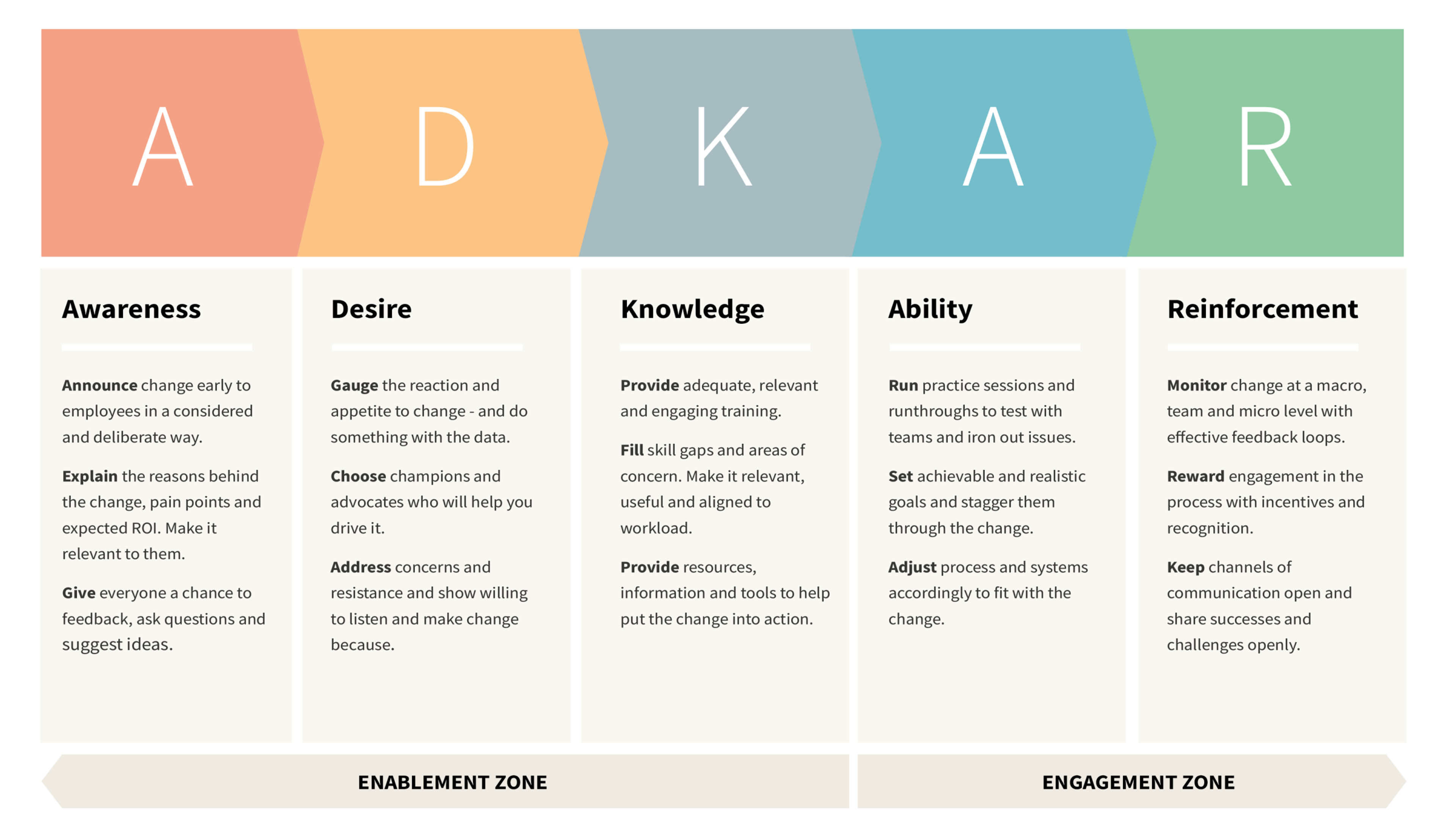
The ADKAR model is a five-stage framework for managing change at an individual level - Awareness, Desire, Knowledge, Ability, and Reinforcement. It helps organisations understand what people need at each point in a change process and where things are getting stuck.
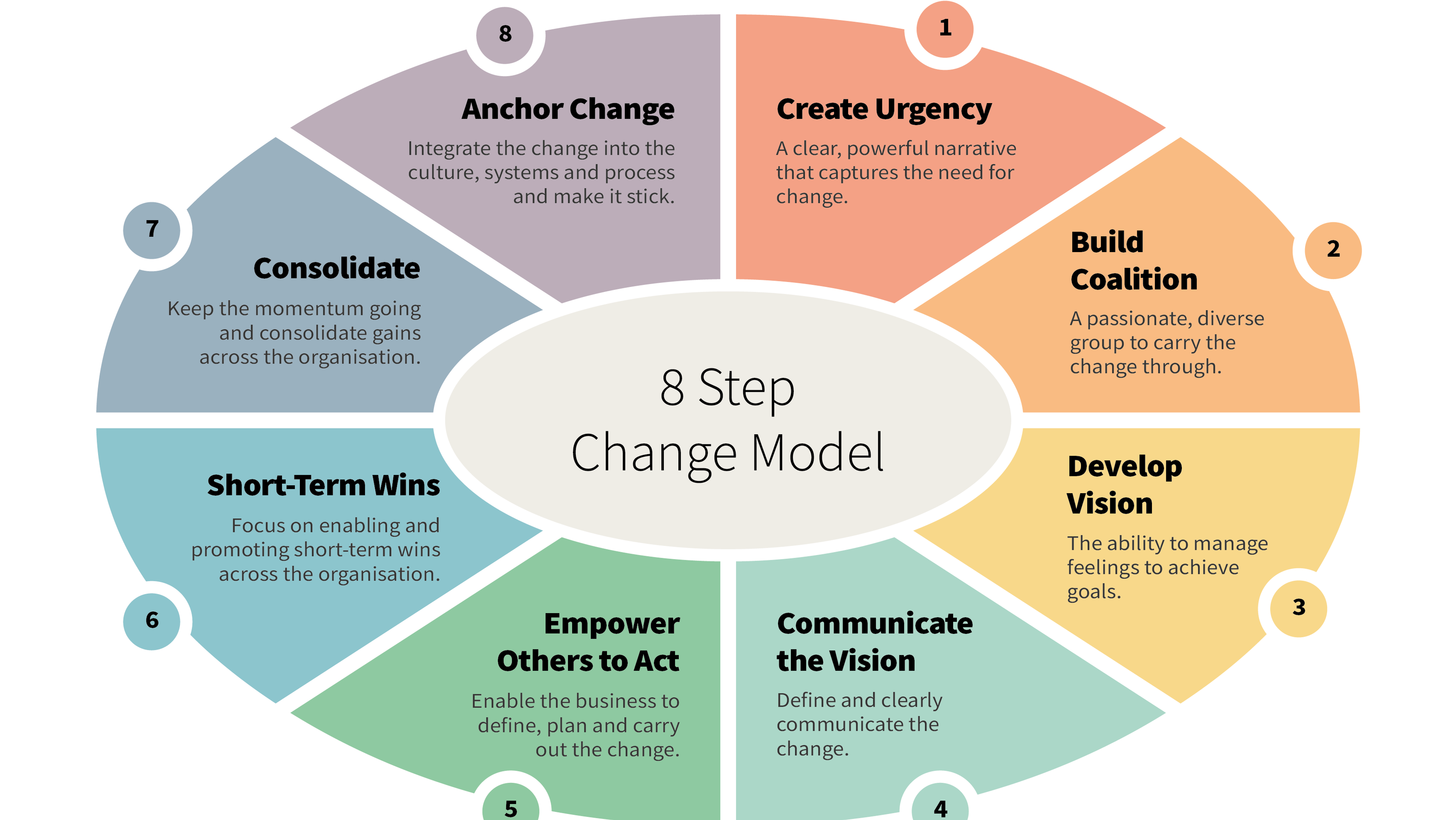
Kotter's 8 Step Change Model is a structured framework for leading organisational change, from building urgency through to embedding new ways of working. It gives leaders a clear sequence to follow when the change is big and the stakes are high.
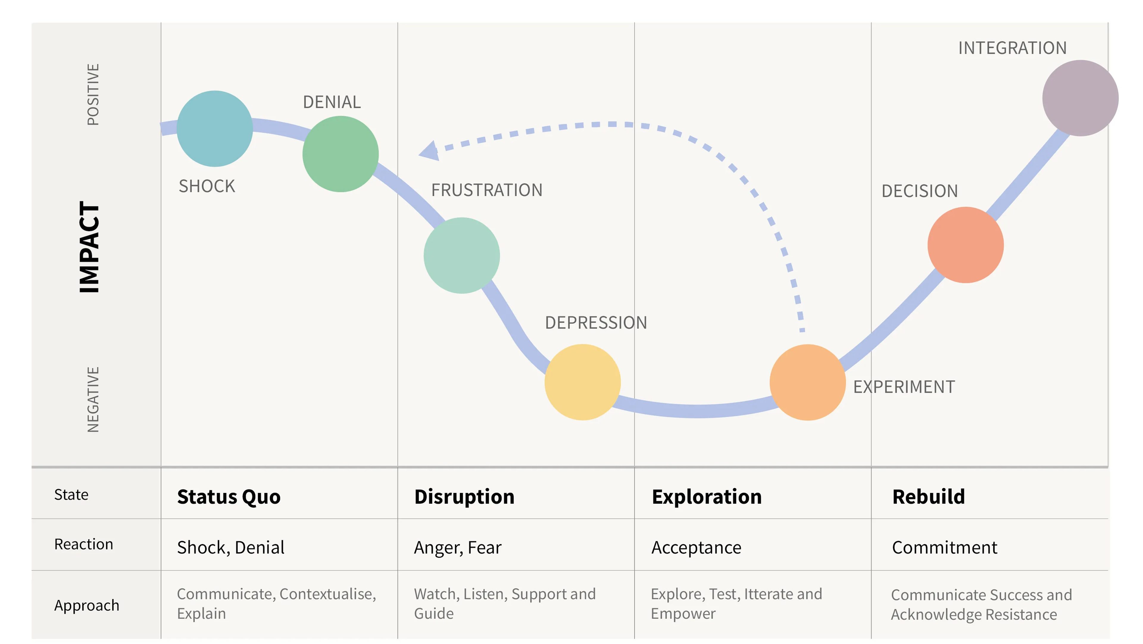
The Change Curve maps the emotional stages people move through during organisational change, from shock and denial through to acceptance and commitment. It helps leaders understand where people are in the process and what support they need.
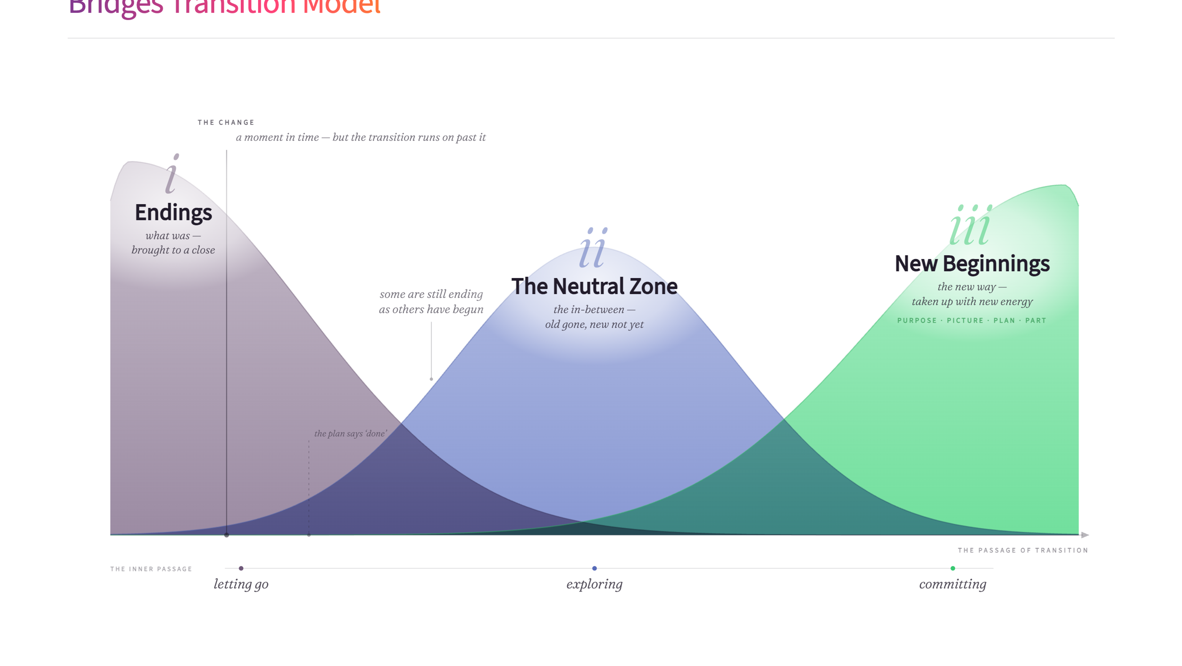
The Bridges Transition Model focuses on the human side of change - the psychological transition people go through rather than the external change itself. It maps three phases: Endings, the Neutral Zone, and New Beginnings.
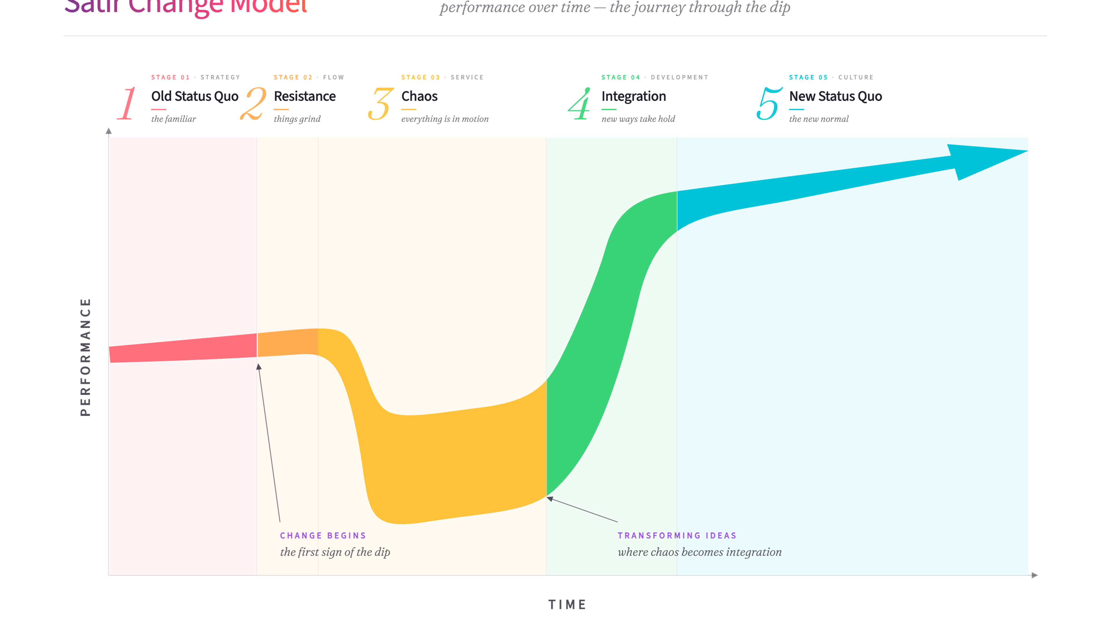
The Satir Change Model maps the emotional journey teams move through during change - from familiar stability through resistance and chaos to integration and a new way of working.
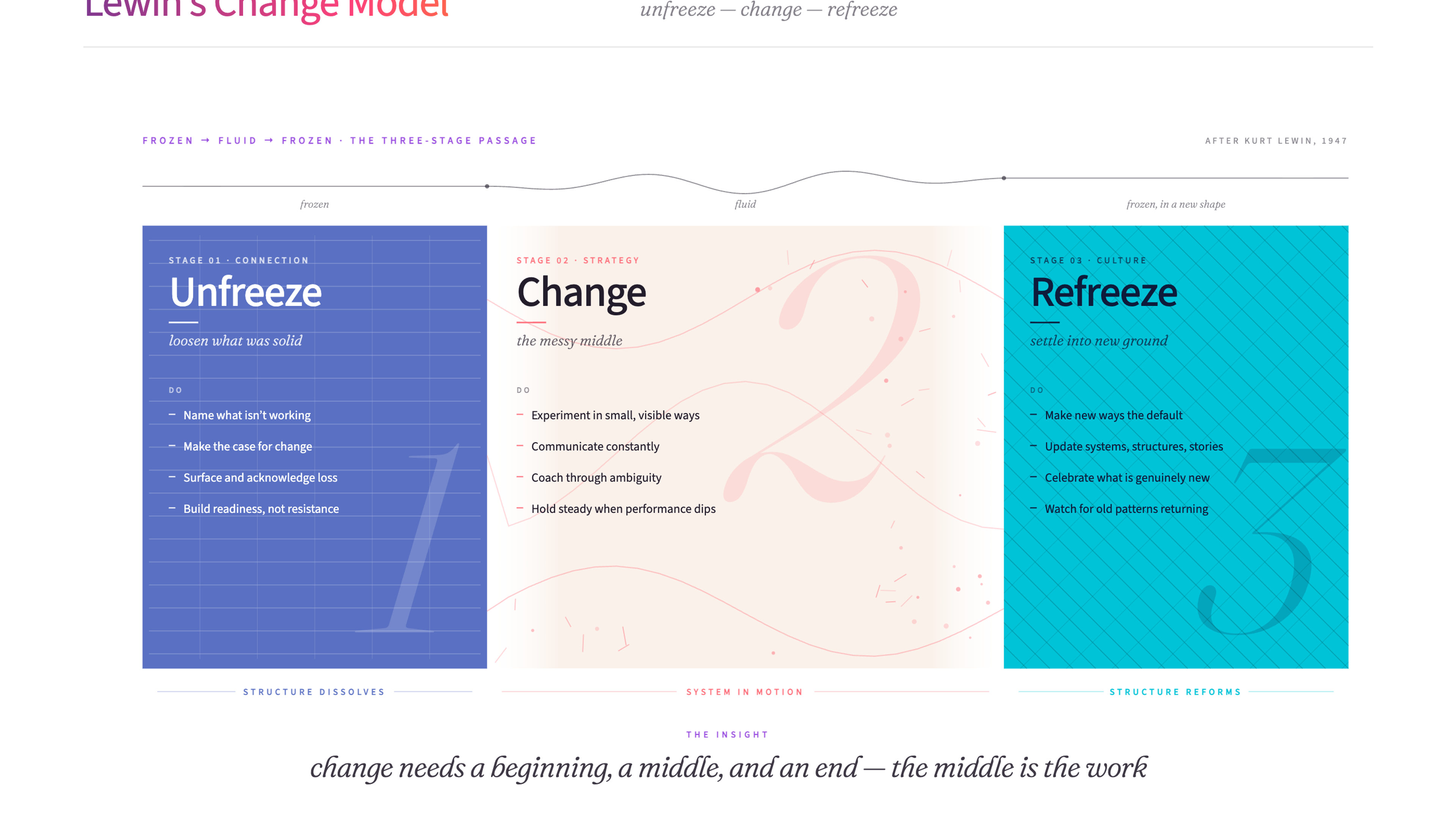
Lewin's Change Model breaks organisational change into three stages - Unfreeze, Change, and Refreeze. Before anything can shift, the conditions holding the current state in place need to soften. Then the change happens. And then the new patterns need to solidify, or the organisation drifts back.
Got change coming, and people who’ll be leading it?
Tell us what’s changing and we’ll help you work out the right support for them.